Blog
Pivot! 12 reasons why Architects make great UX Designers
By: Laura Denton,10 February 2022
In late 2021, I decided to take off the hat I had worn for the last 15 years as an architect and pick up a new hat as I pivoted my career into the world of UX Design.
As the former Director in charge of operations for the Gensler Sydney Office, I knew too well the pain and struggles of sifting through CVs to find the ideal candidate for a particular role. So, I asked myself - as a former hiring manager…
“What would I want to know about someone who had recently pivoted?”
and I thought…
“How would they establish credibility with me as a top candidate, particularly if they were quite senior and but their entire career had been in another industry?”
So, I pulled out my trusty UX toolbox and decided to UX myself and my new industry. I got curious about what UX experts felt set the entry level UX practitioners apart from the seasoned UX bunch. It turned out that I had a lot of highly valuable transferrable skills.
. . .
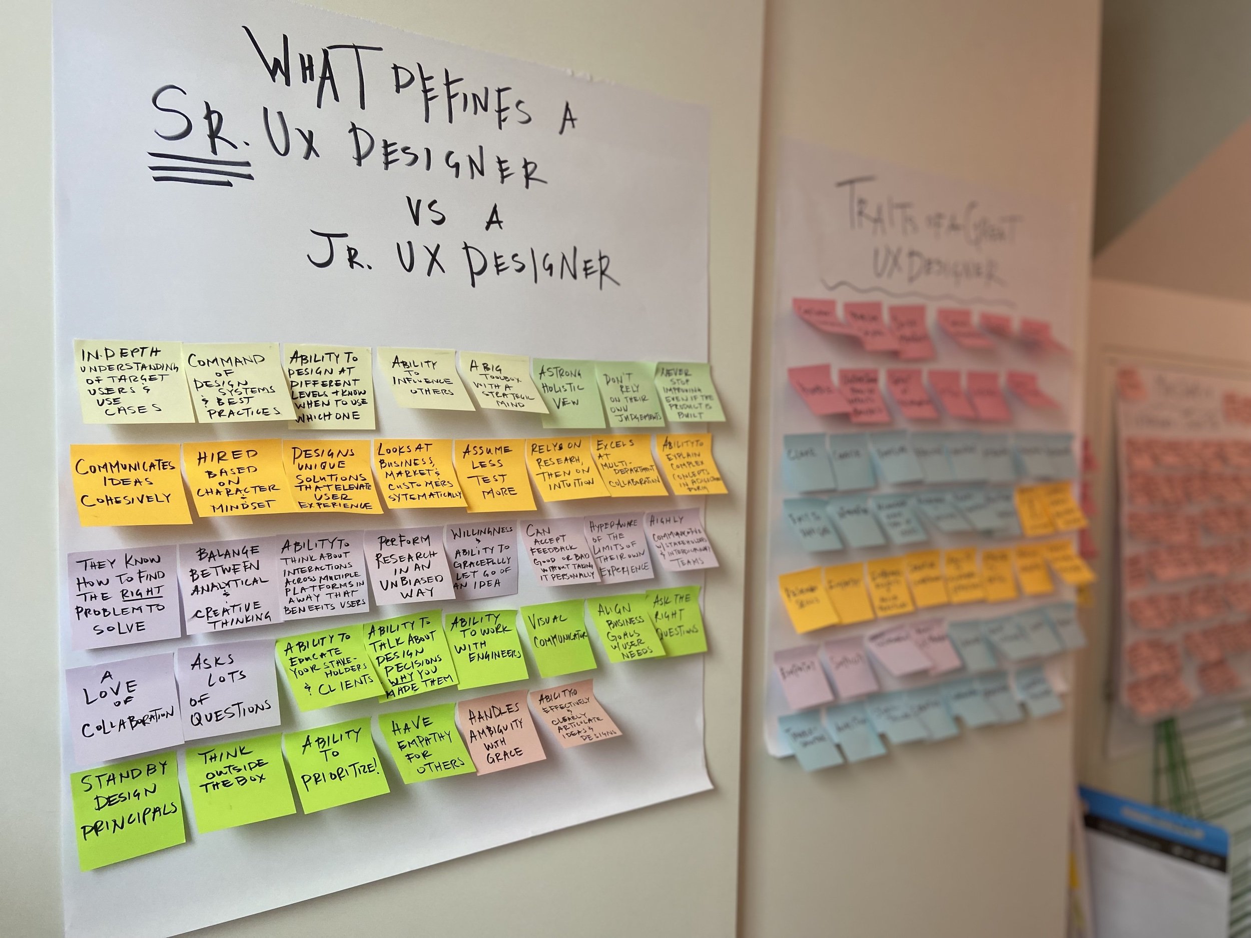
I looked at numerous articles with titles like “Hiring UX designers: 11 qualities to look for”, “10 Qualities My Senior UX Designer Asked Me to Develop Before Starting”, “12 traits of a great UX designer”, “What 18 experts say makes a good UX designer” and “Senior UX Designer VS Junior UX Designer”. I captured their key quotes, affinity mapped them, and studied the key themes.
I dusted off a copy of one of my favourite books 101 Things I Learned in Architecture School and thought about the key strengths of architects. I reflected on my own skills and strengths gathered over the last two decades and found a lot of overlap.
I’ve summarised my conclusions as 12 key reasons why Architects make great UX Designers.
TL;DR
We are skilled problem solvers. We have a big toolbox and a strategic mindset.
We are great storytellers. We have the ability to effectively and clearly articulate ideas verbally and graphically
We are skilled collaborators. We excel at multi-disciplinary collaboration and are highly communicative with clients, stakeholders, and our teams.
We take a holistic view. We have the keen ability to think about details from the micro to the macro and understand the impacts of design decisions made at both ends of the spectrum.
We know how to design at different levels of fidelity and know the right time to use the right tool. Soft ideas - soft lines. Hard Ideas - hard lines.
We can accept feedback, good or bad, without taking it personally. We are hyper aware of the limits of our own experience.
We understand how design decisions impact business. We have the ability to look at the goals of the business, the client and the user - all at once.
We have a command of design systems and complex design tools. We have a knack for learning new software.
We value simplicity and white space. We are taught from day one of architecture school that “Less is more”.
We design for accessibility and inclusivity.
We have the ability to prioritise and know how to say no. We have to balance design with budgets and construction feasibility.
We have similar artefacts and processes.
Key takeaway:
The list only begins to touch on the many commonalities between Architects and UX designers. Ultimately, the focus of these two disciplines is about designing for people.
Both use empathy and curiosity to design memorable and meaningful human centred experiences.
It is no surprise that many architects before me have made the same seamless career transition that one described as less of a pivot and more of a “small step to the side”.
01 We are skilled problem solvers
We have a big toolbox and a strategic mindset.
In every phase of the design process architects are faced with numerous complex problems to solve. I recently delivered a retail store for a brand that had never existed as a brick-and-mortar retailer in Australia.
My first challenge was to get up speed on their business metrics. I had to first understand data provided from their sales team that quantified the minimum inventory units they needed to fit into the store, for the store to be profitable. Next, I had to perform a detailed analysis of how each of their display fixtures would present the merchandise with adequate storage. Then I had to look at the customer journey through the space, key department adjacencies, and how to showcase the most important products front and centre.
This process took about two weeks, and a few rounds of phone calls, meetings, and emails with the client. That was just the discovery phase. We hadn’t designed anything yet, and we’d already solved numerous problems.
As soon as we put pen to paper in concept design, the problem solving kept going.
How would we create memorable experiences for the customers in the store without blowing the client’s budget?
How would we detail this fixture so that it can be easily and cheaply reproduced and manufactured for many future stores across Australia?
How could we simultaneously solve for the pain points of the client, the brand, and the landlord – especially when all their goals competed with one another - all while needing to meet a strict budget and timeline?
The ability to be nimble and rapidly tackle complex problems as they come, is a skill I’ve been perfecting over many years, one that has added great value to my practice as a UX designer.
02 We are great storytellers
We have the ability to effectively and clearly articulate ideas verbally and visually.
Architects are taught early on that the journey through the space is just as important as the design itself. As such, we must present our designs in a way that leads the client along that journey.
What happens before they get there?
What is the arrival process like?
What happens when they are in the space?
Are they performing special tasks?
Do we want the user to dwell and spend lots of time there - as in the case of a retail store?
Or do we want to get them to leave quickly so the next customer can sit down - as in a restaurant?
Should the furniture be comfortable or uncomfortable to prompt this behaviour?
We are constantly thinking at this level of granular detail at every single step of the design process, and it’s our responsibility to be great storytellers so that we can bring our clients on the same journey.
03 We are skilled collaborators
We excel at multi-disciplinary collaboration and are highly communicative with clients, stakeholders, and our teams.
An essential part of delivering successful Architecture and Interior Design projects relies on the support of a solid team of specialist consultants and engineers.
Architects by definition are generalists - we know something about a lot of different topics, but rely on specialists, such as mechanical engineers, electrical engineers, structural engineers, lighting designers - the list goes on - to perform specialist roles in the realisation of our designs.
We become skilled collaborators from very early on in our careers. We excel at working within multi-disciplinary teams, and strong communication skills are essential to our success.
For this reason, architects are naturals in UX design collaboration – we can easily leverage these skills when it comes to working with developers, business analysts, product managers, product owners and other key stakeholders.
04 We take a holistic view
We have the keen ability to think about details from the micro to the macro and understand the impacts of design decisions made at both ends of the spectrum.
Architects think in floor plans, site maps, and models. We visualise the world from a top-down and three-dimensional point of view simultaneously. This skill allows us to be expert visualisers of not only spaces, but also ideas, fostering a holistic vision of the design process required for a given project.
We work in the micro scale to the macro scale. We must think about everything from site analysis - how is the building situated on the site to get the best daylight, views, circulation, and access - all the way down to what the transition between the timber floor and the tile floor will look like.
We perform this process of zooming in and zooming out in our minds constantly throughout the life of the design process.
This skill allows us to take a holistic approach to the design of digital products as well. Visualising the future impacts and knock-on effects of everything - from a small decision in the construction of a design system to the structure of the information architecture. We can spot potential issues before they arise and prevent them from becoming bigger problems down the line.
05 We know how to design at different levels of fidelity and know the right time to use the right tool
Soft ideas - soft lines. Hard Ideas - hard lines.
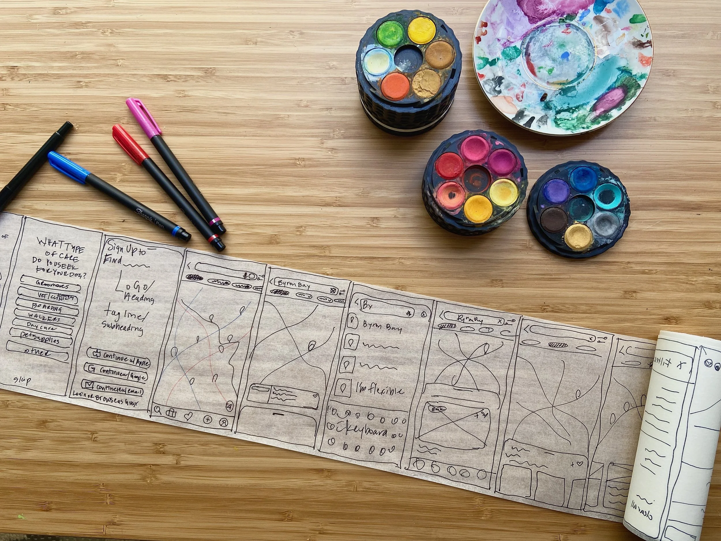
One of the first lessons we learn in design school is how to sketch, draw and draft by hand. We explore a variety of tools and drawing implements. We become pen, pencil, and marker fanatics.
We learn that the quality of our line-work and drawings say something about the stage the idea is in.
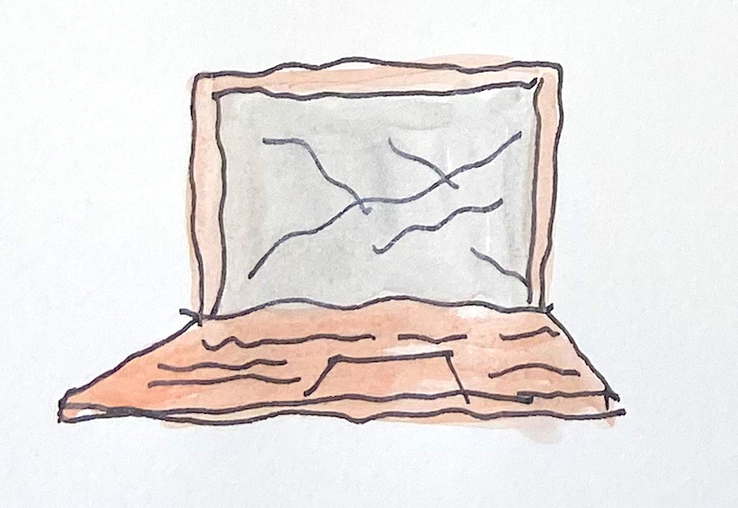
Should the lines be loose and soft – to convey early conceptual ideas?
Or hard and precise to communicate a more resolved level of design?
We learn from our clients’ reactions that when a drawing or rendering is too polished, too early - our clients struggle to focus on the important content we are trying to convey and instead get distracted by details like colours or finishes that we haven’t even defined yet.
This makes us great at the craft of UX design – flexing our skills easily between sketching, wire-framing, and rapid prototyping in low to hi fidelity, and knowing when the right tool is most appropriate.
06 We can accept feedback, good or bad, without taking it personally
We are hyper aware of the limits of our own experience.
As young architecture students, we are put through the wringer. An average graduate in five years at architecture school has delivered an estimated 30 - 40 design presentations in front of a live audience before even stepping foot into an office. This number would be in the multiple 100s by the time someone like me reaches 15 years into their career.
The practice of giving critiques, receiving critiques, and acting on that feedback is engrained in us from day one. We are taught that the strength of our designs comes from repetitious feedback, iteration, and continuous refinement.
We learn not to sweat the small stuff and not take the feedback personally, because without the culture of collaboration and feedback, our designs plateau and cannot evolve.
This is an essential skill in the UX process, allowing us to be empathetic, active listeners when receiving feedback - from our users, the business, the development team, and all other stakeholders – and to process that feedback in a way that delivers meaningful insights for strategic implementation.
07 We understand how design decisions impact business
We have the ability to look at the goals of the business, the client and the user - all at once.
Commercial architects like myself have spent decades working with clients in all types of industries with the common goal - to run a successful business.
It is our responsibility to educate them on the value that design brings to their business, but also balance the feasibility and viability of our ideas so that we meet their budget and their timeline.
We can deliver a stunning design, but the client will rarely walk away happy if you’ve blown their budget or caused project delays.
A strong sense of business acumen is essential for a UX designer. Having desirable solutions that solve for customer pain points is useless if the solutions are not feasible within the constraints of the technology or viable from a business perspective.
08 We have a command of design systems and complex design tools.
We have a knack for learning new software.
Deovrat Dwivedi, in their article on Medium titled 12 reasons why architects make good UX designers, said it best.
“Architects envision and convey ideas to people before they exist. The process makes them pros at several design tools for Building Information Modeling (BIM), 3D modeling & rendering, 2D drawing, post-processing, and photo/video editing. They know the Adobe and the Autodesk suits like the back of their right hand. A big part of everyday work for a UX Designer is about learning and using multiple research and design tools to make the processes more efficient and optimised. Here the aptitude of learning and using complex design tools comes to their aid.”
09 We value simplicity and white space
We are taught from day one of architecture school that “Less is more”.
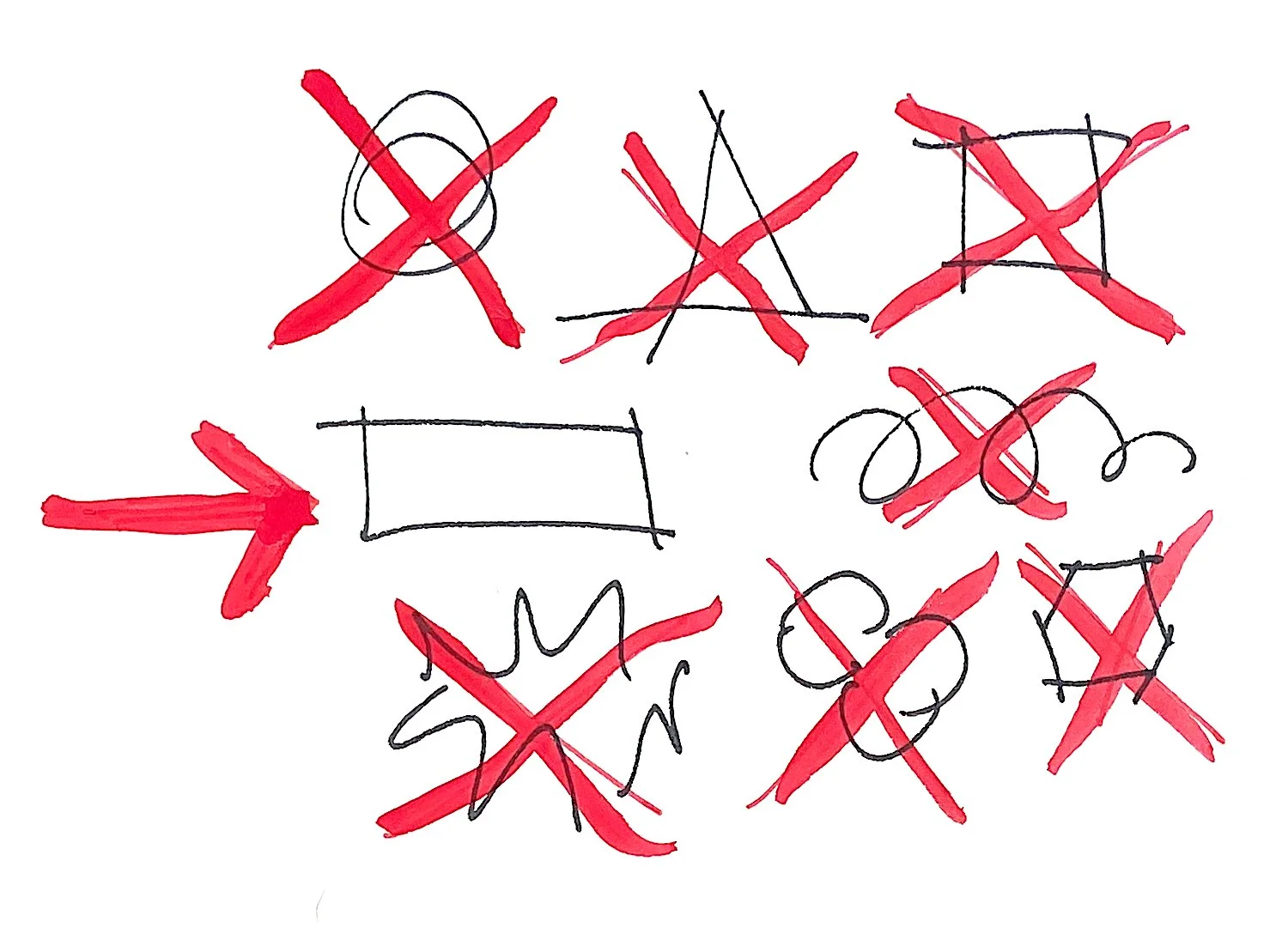
One of the first things you learn in design school as an architect is how to draw a line. Sound ridiculous? Well, not so. It’s actually one of the defining foundations that makes us such good visual communicators.
We learn about the relationship of objects to one another and how that relationship is just as important as the objects themselves. We learn about figure ground - a fancy way of saying – we understand whitespace.
And we learn how to draw diagrams for our designs called “partis” – which are essentially lo-fi wireframes of our buildings.
“Less is more” — MIES VAN DER ROHE
We are taught that less is more. Simplicity is the key to memorable elegant and functional design.
I see a lot of designers early in their career - architects and UX designers alike - thinking that innovation comes from painfully complex ideas and radical solutions, but in fact, it is just the opposite.
The simplest designs that are familiar to the user are the ones that ultimately connect with humans the best.
The famous architect Louis Sullivan put it best – form follows function.
“Form follows function” — LOUIS SULLIVAN
10 We design for accessibility and inclusivity
From the moment you step foot in an office, you are introduced to the code book. The entire premise of modern building code requires architects to design buildings, while providing equal access to all users and creating a safe environment for them to inhabit.
For this reason, architects naturally think with accessibility and inclusivity in mind. Their designs can never become a reality without it.
As UX designers, we pick up concepts of accessibility and inclusivity quickly and integrate them into our designs with ease.
11 We have the ability to prioritise and know how to say no
We have to balance design with budgets and construction feasibility.
If you ever spend a week working with an architect, you’ll soon realise that their minds are incredible playgrounds. Their imaginations are firing on details as broad as a site map, and as granular as a paint colour.
They are responsible for collating and prioritising a constant stream of feedback – from their bosses to their clients to the engineers and the many other stakeholders - and it’s their job to weed through that feedback and decipher which input to act on, and which input to politely omit.
Successful architects, like successful UX designers, are guided by the project goals and vision, and are consistently checking back in with it, as they make decisions on how to move forward.
12 We have similar artefacts and processes
Many people may not realise, but there are multiple phases in the architectural design process that precede concept design - that moment when you first put pen to paper and start sketching.
Like UX, research and analysis are the foundations of our design process. Without them, we could design a beautiful building, but it won’t properly function for the user and would be a waste of the clients’ time and money. We understand the value of doing our due diligence and properly understanding the brief and problem space before we start ideating.
We produce similar diagrams, sketches, and wireframes of our designs that later turn into models – or prototypes – for testing ideas with our clients. This process all takes place well before we produce the final construction documents – or annotated drawings – for the contractor to build.
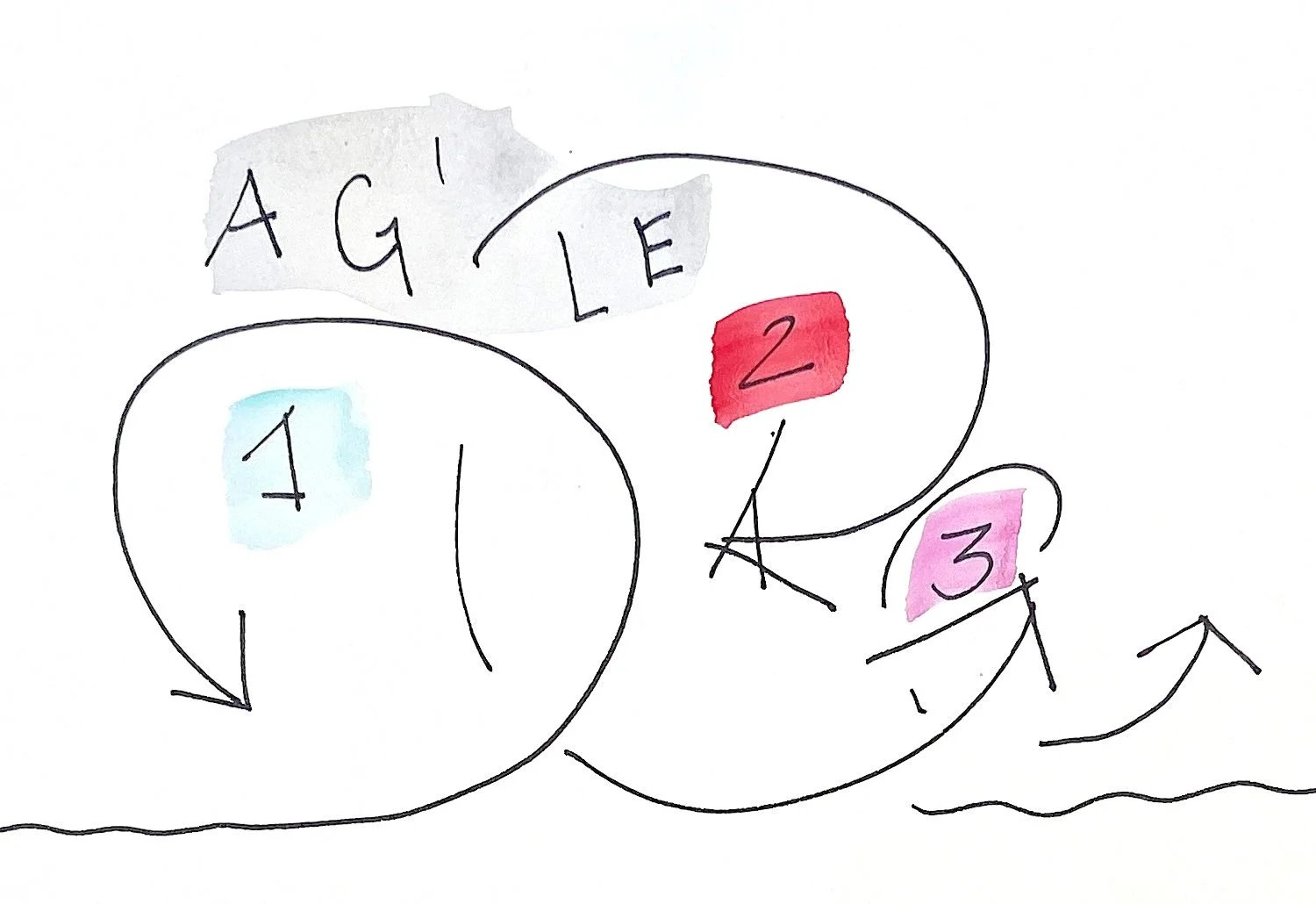
It is also a common misconception that architecture is purely a waterfall delivery method. In reality, there are a series of agile sprints happening at every stage of the design and delivery process.
Like UX designers, our ability to execute strong considered design ideas relies on a series of numerous iterations, testing, and feedback from our clients and other experts, and continuous refinement – even well into construction.
We must be light on our feet, deliver drafts of our work often and test our designs with our clients and team members regularly, just as UX designers do.
Conclusion
The list only begins to touch on the many commonalities between Architects and UX designers. Ultimately, the focus of these two disciplines is about designing for people.
Both use empathy and curiosity to design memorable and meaningful human centred experiences.
It is no surprise that many architects before me have made the same seamless career transition that one described as less of a pivot and more of a “small step to the side”.
Honourable Mentions
I would encourage you to also check out the work of my peers for an expanded view on the same theme.
